Question One
In what ways does your media product use, develop or challenge forms and conventions of real media products?
Opening Titles

Link:
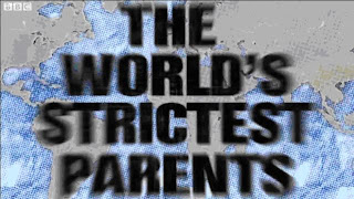
http://www.bbc.co.uk/iplayer/episode/b00pgm4b/The_Worlds_Strictest_Parents_Series_2_Update/The opening titles of a documentary play an extremely important part in the making of the documentary as it reflects what the program is about; even the font style reflects the feel the makers of the documentary are trying to get across. Here the font reflects the theme of the show as it is bold and angular, almost as though it should be used for an army advert; this allows the audience to get a feel for the show. Even the way in which it enters the screen is important as it also reflects the style of the show, in ‘The Worlds Strictest Parents’ the title comes on rapidly and seems to be hitting the screen which again gives a certain feel towards the documentary.
.JPG)

 Interview Framing
Conventional framing of a documentary
Link:
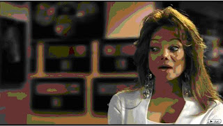
http://www.youtube.com/watch?v=jtgNXDANC-cInterviews are framed to either the left or right of the screen in medium close up or close up. The eye-line should be around the top 1/3 of the screen with a mise-en-scene that has a relevance to the topic either of the documentary itself or of the interviewees profession this makes it easier to follow from the audience’s point of view.
The Framing in my documentary:
 Graphics
Conventional use of graphics
Link:
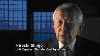
http://www.channel4.com/programmes/the-day-of-the-kamikaze/4od/player/3012049Graphics pay a key part in an interview as they inform the audience of who they are listening to and there relevance to the topic. The graphics enter the screen in various ways here I have shown a fade in, whereas my documentary uses a scroll. Conventionally the name of the interviewee is in a larger font than there relevance to the topic or job title but in mine I have only used the name as the interviewees job title is unimportant in the interview and there relevance to the topic is heard during the interview.
Graphics in my documentary


 Archive Material
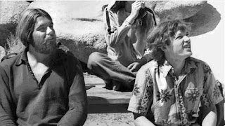
Zoom on Archive Material
Link:
http://www.channel4.com/programmes/daredevils/4od/player/3009577
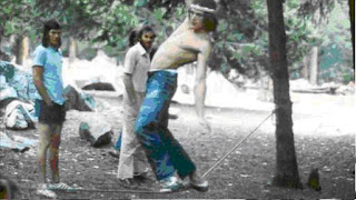
Panning on Archive Material
Link:
http://www.channel4.com/programmes/daredevils/4od/player/3009577Documentaries throughout have to stay entertaining so as the audience continues to watch which is why they use various filming techniques and video transitions during the still images for the archive material. The two main filming techniques used are zoom and pan as shown above. Below is an example of a transition I have used.


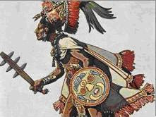
Transition/superimpose
Overall my documentary follows many of the conventions of a typical documentary; I have chosen to do this as to make it recognizable to audiences as being a documentary and also as to make it less confusing to the audience and to keep the programme entertaining.
Question TwoHow effective is the combination of your main product and ancillary texts?
I have tried to make the main product and ancillary texts work together through creating coherences throughout all of them:
Voiceover – The voiceover used for both the radio trailer and documentary is done by the same person, this helps to create a link between them, and also it helps make sure that the voiceover is still targeting the same audience.
Clips from Documentary – Also in the radio trailer we chose to use clips from the voxpops and also from the interviews, this creates a strong link between the trailer and documentary as we are including teasers from the documentary to help attract the audience but also to link both.
Scheduling – The scheduling is used on all of the ancillary texts along with the title and slogan of the show. This directly links the texts to the main product, and helps advertise it.
Images – The image used for the print advert links with the documentary as it shows various people with piercings as one face, this is to shock the audience as it produces a weird image which is how the documentary entertains its audience through the shock factor produced by some of the images and stories throughout.
 Radio Trailer Script –
 The radio trailer script includes clips from interviews and the voxpop, this is done to create a strong link between the radio trailer and the documentary itself but also the clips are used to tease the audience. Here is the radio trailer script:
Over the years views on Piercings and Tattoos have changed, from being used to represent anything from crime to wealth and status, to now where they can be seen as fashionable or in the extreme form…
‘Very very ugly’
‘I don’t like it’
‘Strange, very very weird’
‘Funky’
During this documentary we explore the lives of people world known for there full body tattoos or piercings, seeing how people react and why they felt the need to be so extreme in there body modification.
Why does anyone feel the need to get a tattoo or piercing?‘Very very ugly’
‘I don’t like it’
‘Strange, very very weird’
‘Funky’These are taken directly from the documentary, the reason I have chosen to use these specific clips is because they are short, do not give away too much about the documentary, and leave the audience to imagine what the person they are commenting on looks like which will make them curious and hopefully in turn make them want to watch the documentary.
Why does anyone feel the need to get a tattoo or piercing?I chose to use this as this question is asked throughout the documentary, also as it is one of the last things the audience hear it will get them thinking about it enough for them to have an interest in the topic and want to find out more.
Here is a list of radio stations that I feel would be appropriate for the radio trailer:
National Radio Stations
Radio 1
Radio 4
Virgin Radio
Local Radio Stations
Juice FM
Rock FM
Heart FM
List of local stations for various local stations and there areas:
BBC Coventry and Warwickshire
Coventry
BBC London
LondonBBC Radio Berkshire
Reading BBC Radio Bristol
Bristol
BBC Radio Cambridgeshire
Cambridge BBC Radio Cornwall
Truro
BBC Radio Cumbria
Carlisle
BBC Radio Derby
Derby
BBC Radio Devon
Plymouth
BBC Essex
Chelmsford
BBC Radio Gloucestershire
Gloucester
BBC Radio Guernsey
St Sampson'sBBC Hereford/Worcester
Worcester BBC Radio Humberside
Hull
BBC Radio Jersey
St.HelierBBC Radio Kent
Maidstone BBC Radio Lancashire
BlackburnBBC Radio Leeds
Leeds BBC Radio Leicester
Leicester
BBC Radio Lincolnshire
Lincoln
BBC Radio Manchester
Manchester
BBC Radio Merseyside
Liverpool
BBC Radio Newcastle
Newcastle
BBC Radio Norfolk
Norwich
BBC Radio Northampton
Northampton BBC Radio Nottingham
Nottingham
BBC Radio Oxford
OxfordBBC Radio Sheffield
Sheffield BBC Radio Shropshire
ShrewsburyBBC Radio Solent
Southampton BBC Somerset Sound
Taunton BBC Radio Stoke
Stoke BBC Radio Suffolk
Ipswich
BBC Surrey
Guildford BBC Sussex
BrightonBBC Radio Wiltshire
SwindonBBC Radio York
York
BBC Tees
Middlesbrough
BBC Three Counties Radio
LutonBBC WM
BirminghamBBC Radio Cymru
Cardiff BBC Radio Scotland
Glasgow
BBC Radio Nan Gaidheal
Stornoway
BBC Radio Ulster
Belfast BBC Radio Foyle
Londonderry
BBC Radio Wales
Cardiff
2BR
Burnley
3FM
Douglas 3TR FM
Warminster
3TFM
Saltcoats 7 Waves Community Radio
Wirral 10Radio
Wiveliscombe Question ThreeWhat have you learned from your audience feedback?
For my audience feedback I showed a variety of people my documentary, radio trailer and print advert then asked these questions:
Documentary
Question 1. Now you have seen the five minutes would you want to watch the rest of it and why?
“I would watch the rest of it as I have tattoos myself”
“Yes, I think it would be interesting to find out why people go to the extremes of tattooing and piecing”
.JPG)
“Not usually something I would watch but watching the first five minutes did make me want to watch more”
Question 2. What are the strengths and weaknesses of the documentary?
“The strengths are that it keeps me interested throughout and I thought the opening titles worked well, I would say the weaknesses are the lack of video footage during the history and also I think there could have been more music”
“I thought the historical information was good also the cutaways used were appropriate as they linked to what the person getting interviewed was talking about or showing us, a weakness I thought is when your talking to the people outside because you can hear the wind quite loudly on some of them”
.JPG)
“A strength would be the graphics on the interview I like how they come on the screen as it is done in the same was as a tattoo also I thought the voxpop was good, a weakness would be that in some parts of the voice over it gets a bit quiet”
Question 3. Do you think that it is appropriate for channel 4?
.JPG)
“I think it would be appropriate for Channel 4, as they have similar types of documentaries on at the moment and also it is something that I would be interested in watching and I regularly watch Channel 4.”
.JPG)
“Yes, Channel 4 shows extreme body programmes”
“Typical type of documentary you would find on channel 4, so yes”
Question 4. What do you think would be an appropriate target audience and why?
.JPG)
“Basically anyone, both old and young people are used in it so it could appeal to anyone”
“Anyone with tattoos or piercings would be interested as it applies to them”
“People with an interest in the subject”
“The history is in depth so also anyone with an interest in history will enjoy watching it”
Question 5. Do you think it looked professional and why?
“Yes, the framing of the interviews was good and also the graphics made it look professional”
“I thought so yeah, the layout of the show was very good and typical of a documentary”
Question 6. How does it compare to a professional documentary?
“I thought it was very good, the graphics used in the interviews were good and cleaver in the way they entered the screen”
“Again the framing of the interviews was the same as a professional documentary although I did feel that it needed more actuality footage”
RadioQuestion 1. What are the strengths and weaknesses of the radio trailer?
“The music used was good as it was the same music used in the documentary itself so therefore creating coherence between the documentary and the radio trailer which I thought worked well, although sometimes the music did get too loud at parts”
“I thought overall it was good apart from sometimes I could not make out what the voice over was saying, as it was too quiet and the music got a bit loud”
PrintWhat are the strengths and weaknesses of the print advert?
“Overall I thought the print advert was good as it looked like a typically advert that would be used for channel 4 because of the logo and the colours”
“I like the title of the documentary and I think the image used was cleaver and represented the documentary well although I did notice that the image was a bit rough around the edges”
Question Four
How did you use media technologies in the construction and research, planning and evaluation stages?

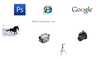
Photoshop – Photoshop was used to design the print advert: this included editing images, designing fonts, creating layouts etc. Also photoshop was used to help convert images into JPEG files so that I could upload them to the blog.
Stills Camera – I used the stills camera for images used for the print advert, the profile pictures for the audience feedback and also to take pictures of the filming and editing process.
Tripod – The tripod was used during the voxpop and also for the filming of the still images used during the voxpop to help create smooth shots.
Video Camera – The video camera was used throughout the documentary for the filming process.
Adobe Premier – Adobe Premier was used for the editing for both the documentary itself and the radio trailer, it was are main peice of editing software so as the editing process went on we got better at using the software and used more of its features such as the transitions, cross fades etc.
Voice Recorder - A voice recorder was used during the questionnaire process at the start of the planning and also druing question three of the evaluation to record audience responces.


.JPG)


 “I would watch the rest of it as I have tattoos myself”
.JPG) “Not usually something I would watch but watching the first five minutes did make me want to watch more”
“Not usually something I would watch but watching the first five minutes did make me want to watch more”.JPG) “A strength would be the graphics on the interview I like how they come on the screen as it is done in the same was as a tattoo also I thought the voxpop was good, a weakness would be that in some parts of the voice over it gets a bit quiet”
“A strength would be the graphics on the interview I like how they come on the screen as it is done in the same was as a tattoo also I thought the voxpop was good, a weakness would be that in some parts of the voice over it gets a bit quiet”.JPG) “I think it would be appropriate for Channel 4, as they have similar types of documentaries on at the moment and also it is something that I would be interested in watching and I regularly watch Channel 4.”
“I think it would be appropriate for Channel 4, as they have similar types of documentaries on at the moment and also it is something that I would be interested in watching and I regularly watch Channel 4.”.JPG) “Yes, Channel 4 shows extreme body programmes”
“Yes, Channel 4 shows extreme body programmes”.JPG) “Basically anyone, both old and young people are used in it so it could appeal to anyone”
“Basically anyone, both old and young people are used in it so it could appeal to anyone”